For the ❤️ Of data: an overview of infographics
Introduction: What is an infographic?
Great question, glad you asked. Infographics are visual representations of information, or data visualization.
What makes a good infographic?
Beyond good aesthetics, a good infographic presents information that is meaningful to its audience. Anyone can create charts and graphs and lay them out on a page. An infographic goes beyond that – it shows, it doesn't tell. It uses rich data and graphics to tell a story.
Depending on the message and objective that is being presented, several techniques of displaying key points can be utilized. There are six primary types of infographics that can be used:
- Map
- VS
- Flowchart
- Timeline
- Data visualization
- Visual articles
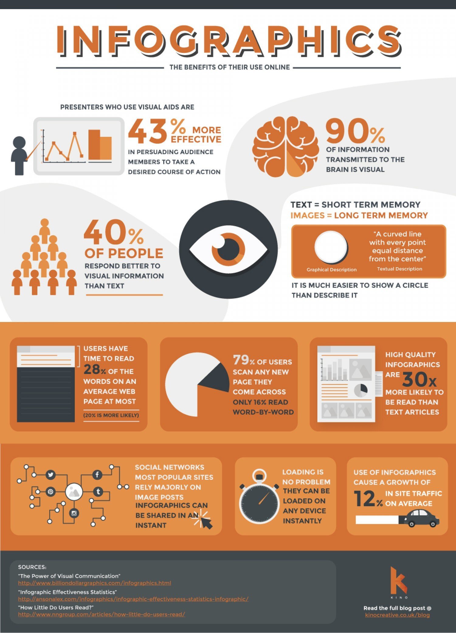
Before we begin, an infographic about infographics. Meta.
Map
Maps are useful for displaying geographical or demographic information. An example of this would be plotting wealth distribution throughout a city's neighbourhoods, how people voted in what state (or province), or where people groups are located.
Versus
Versus is used to compare two topics. Nascar and Formula 1 in the graphic above. It can compare the pros and cons, the similarities between two products like game systems, or the benefits of print and digital, to give a few examples.
Timeline
Timelines are a great way to show how something has changed over time or progressed. Take a look at the graphic above. It looks at how debt is affecting the States and how inflation has changed over the years. Another great example is The History of Disruption of technology.
Flowchart
Also known as a decision tree. Need help making a decision? This is an easy way to arrive at a conclusion. Simply answer some questions and follow the path to your conclusion.
Data Visualization
Probably the most common type of infographic, and is my personal favourite because I enjoy stats and research. Best of all, the topics the you can cover are virtually limitless.
Visual Article
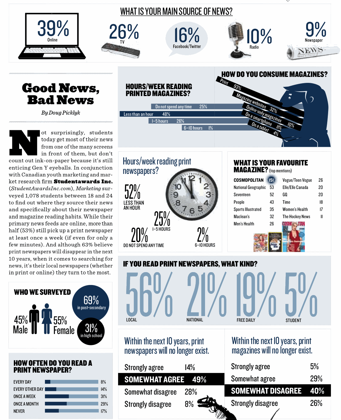
This one is interesting and not as common as the others. It combines editorial while also visualizing the key points in the article.
Have a suggestion for a topic or question you would like visualized? Contact me and let me know!
Sources
Timeline https://www.pinterest.ca/pin/142215300720673801/
Map https://www.shoobx.com/these-are-the-top-eight-startup-cities-outside-of-california-new-york-and-massachusetts/map-infographic/
Visual article https://www.pinterest.cl/pin/38421403041555347/
Data visualization https://www.sethcable.com/datavis/
Versus https://www.columnfivemedia.com/work-items/infographic-nascar-sprint-cup-vs-formula-one
Flowchart https://www.pinterest.ca/pin/285978645061770518/
infographic about infographics https://visual.ly/community/infographic/technology/infographics-benefits-their-use-online


