Peripheral vision and UX design
Resolution of the Fovea compared to the periphery
I mentioned in my previous post that our eyes work almost like a video camera. But unlike a video camera, our vision is not spread out uniformly across a tight visual matrix; instead, it is primarily focused within the center of the retina known as the fovea, which has the highest concentration of cone cells. Our foveal vision is very high resolution — most likely even higher than a 4K television, whereas the pixels that fall out of the boundaries of the fovea are so large that the resolution of our peripheral vision drops dramatically and resembles an 8-bit display.
Given this, we would expect to see the world as through a tunnel. However, our brain can take whatever is directly in the focus take samples of our surroundings, making up a rough estimation of what we’re seeing and fill in the blanks. This explains why we don’t have to memorize an environment, as our brain can take samples and re-samples to gain the required information to create the whole picture. We can discriminate colors better in the center of our vision than the edges because of how densely packed the rods in the fovea are.
The role of peripheral vision
Peripheral vision may seem pointless, but it does three important tasks:
1. It gives cues to our fovea to move our eyes in the direction of what is important in our visual field.
2. It detects motion. Similar to guiding our fovea, when we detect movement outside of our direct visual field, it draws attention which gives a cue to look in the direction of what is moving. Finally, it helps us see better in the dark.
Website and software examples of heavy artillery
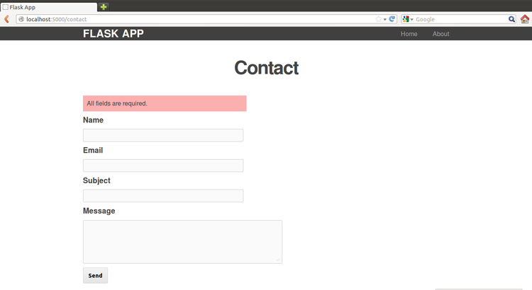
Peripheral vision has very low acuity, resulting in error messages being easily missed by users by the fact that the message doesn’t fall within the direct field of vision. Putting an error message in front of the user’s field of view still doesn’t mean the user will see it. If the message is in red and everything else on the page is red, the message will still be missed. There area number of ways to visually define an error. Using symbols such as warning triangles or reserving red for errors is the easiest way to ensure an error is noticed.
Pop up messages are annoying
Popup alerts can drive a user insane, especially five or six pop up one after the other. Inline errors — those that don’t interrupt the user’s workflow and highlight errors right away without the user needing to take action by submitting the form on the web is the best solution unless the user has taken action that could have severe and or negative consequences such as deleting all files.
Sound as an alert
Another method used to obtain the user’s attention is beeping. Not the most efficient alert depending on the environment. A cubicle farm or noisy warehouse would be examples of this. In an office space, no one would be able to decipher whose computer was making the noise.
Wiggling or blinking or flashing
The third and final way to draw attention is to wiggle or blink. Using a slight motion to draw a user’s eye will alert them to the fact that there is a problem or something needs their attention. Blinking is not the preferred choice as this can be extremely distracting if used incorrectly. Blinking or flashing should be used more subtly as is the case with menu bar actions.
Using the methods outlined above can render them useless as they become predictable and over time are rendered useless. It’s like highlighting everything on a page — if everything is highlighted, nothing is.
Adding some “pop”
Making something pop by differentiating the element(s) you want your users to focus on allows them to find what they need faster. Using color sparingly makes noticing something much easier when glancing. Likewise, giving distinguishing features to an icon-based on the shape and or color can increase a user’s ability to find what they’re looking for.


